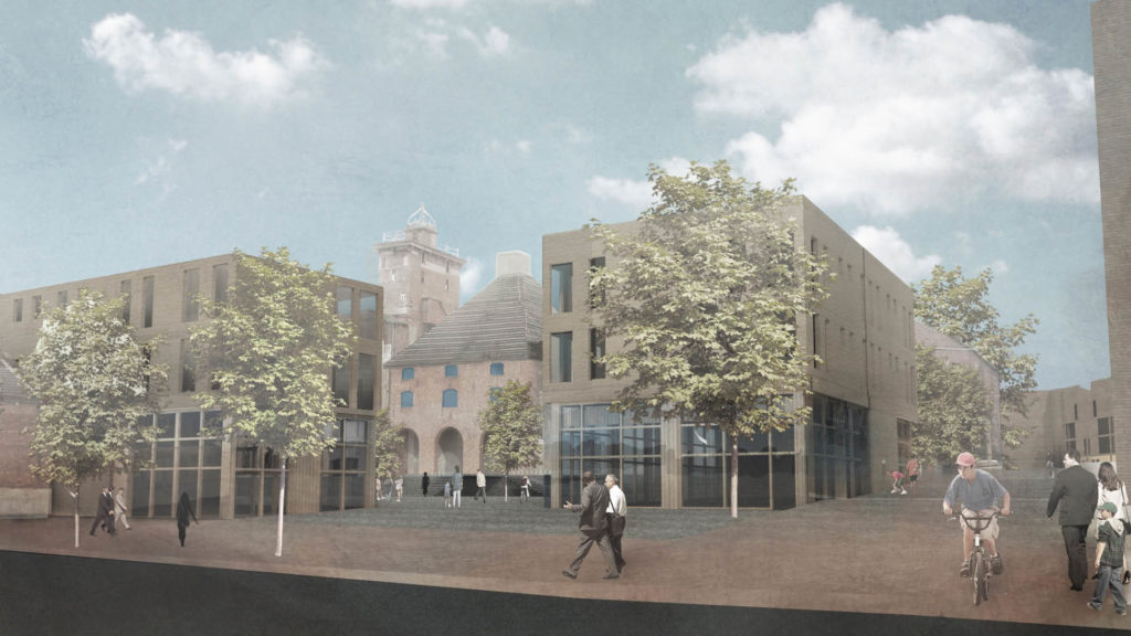
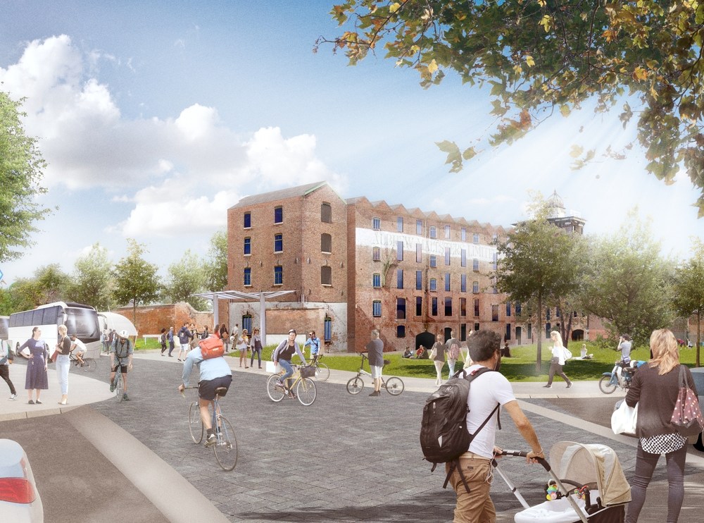
In 2019, we were commissioned to work on branding and visual identity for the Historic England owned Shrewsbury Flaxmill Maltings: a remarkable story of innovation, evolution, pioneering spirit and working life that will be rejuvenated in its new role as a dynamic co-work facility, multi-use arts and events venues, connected social spaces and hub for modern living. The brief was to develop a brand narrative, proposition and tone of voice and create a new visual identity as part of a regeneration project which will see the Maltings become a flagship for thoughtful, modern, multi-use regeneration of heritage buildings.
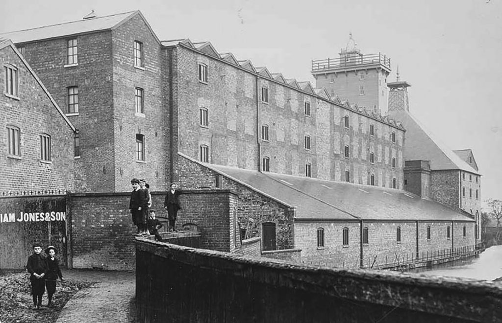
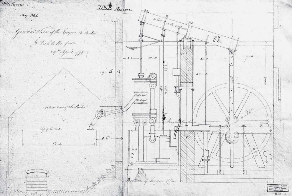
The site hosts one of the most important and extraordinary buildings in the world and has played a central role in the life of Shrewsbury and the region for centuries. At the time of its construction in the 1790s, it was a bold and experimental first step towards the multi-storey buildings which define many of our cityscapes today, being the first mill in the world to have an iron frame to protect against the fires that destroyed so many similar buildings at the time. It has been a mill, a maltings, a second world war barracks and includes an ‘apprentice house’ where indentured children from poor families were once accommodated. This iconic monument of the Industrial Revolution is now ready to embrace its third century of use; becoming a vibrant place to learn, work, socialise and live once again.
Approach
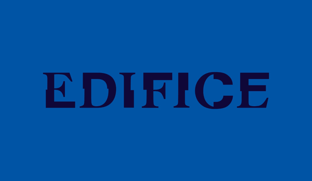
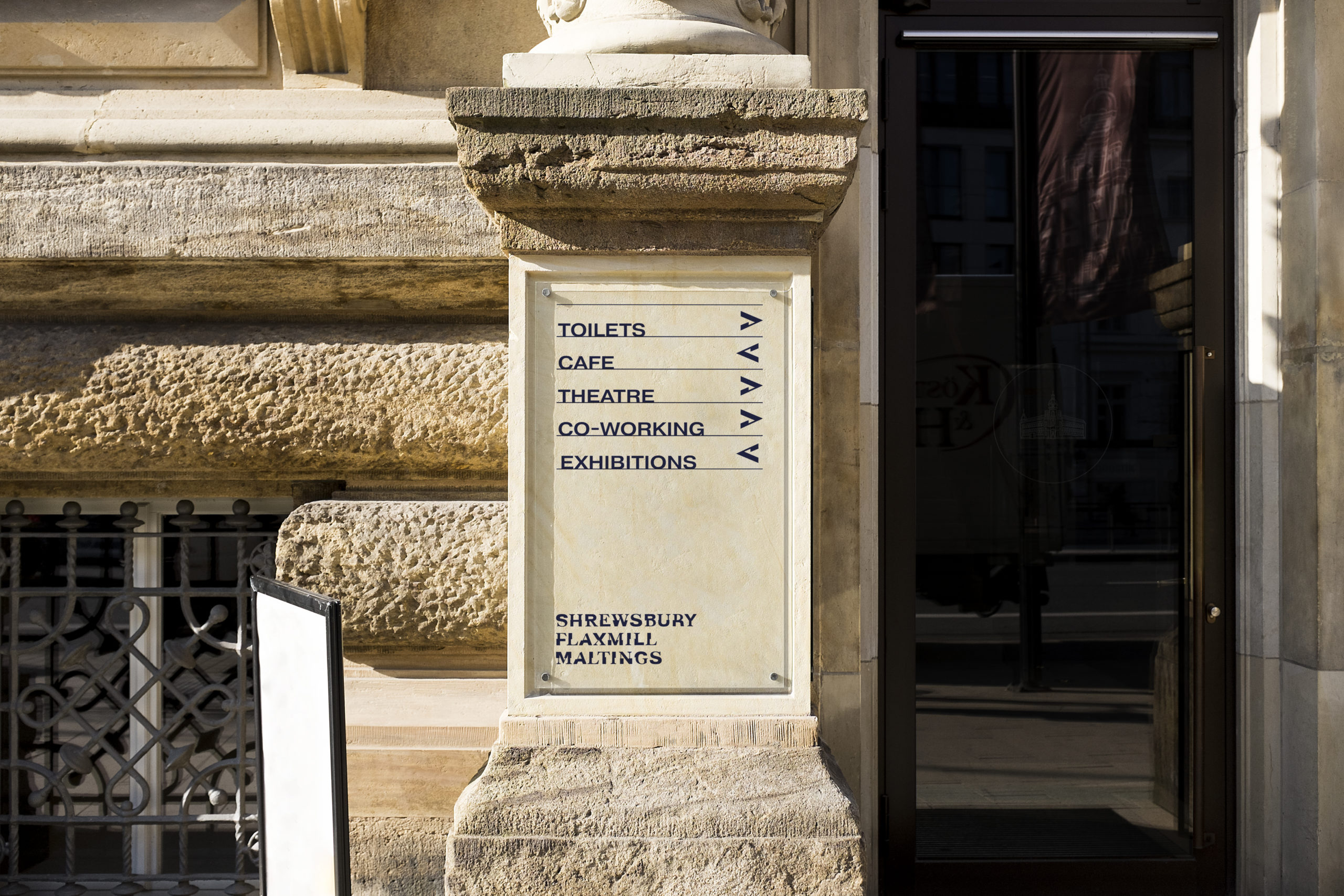
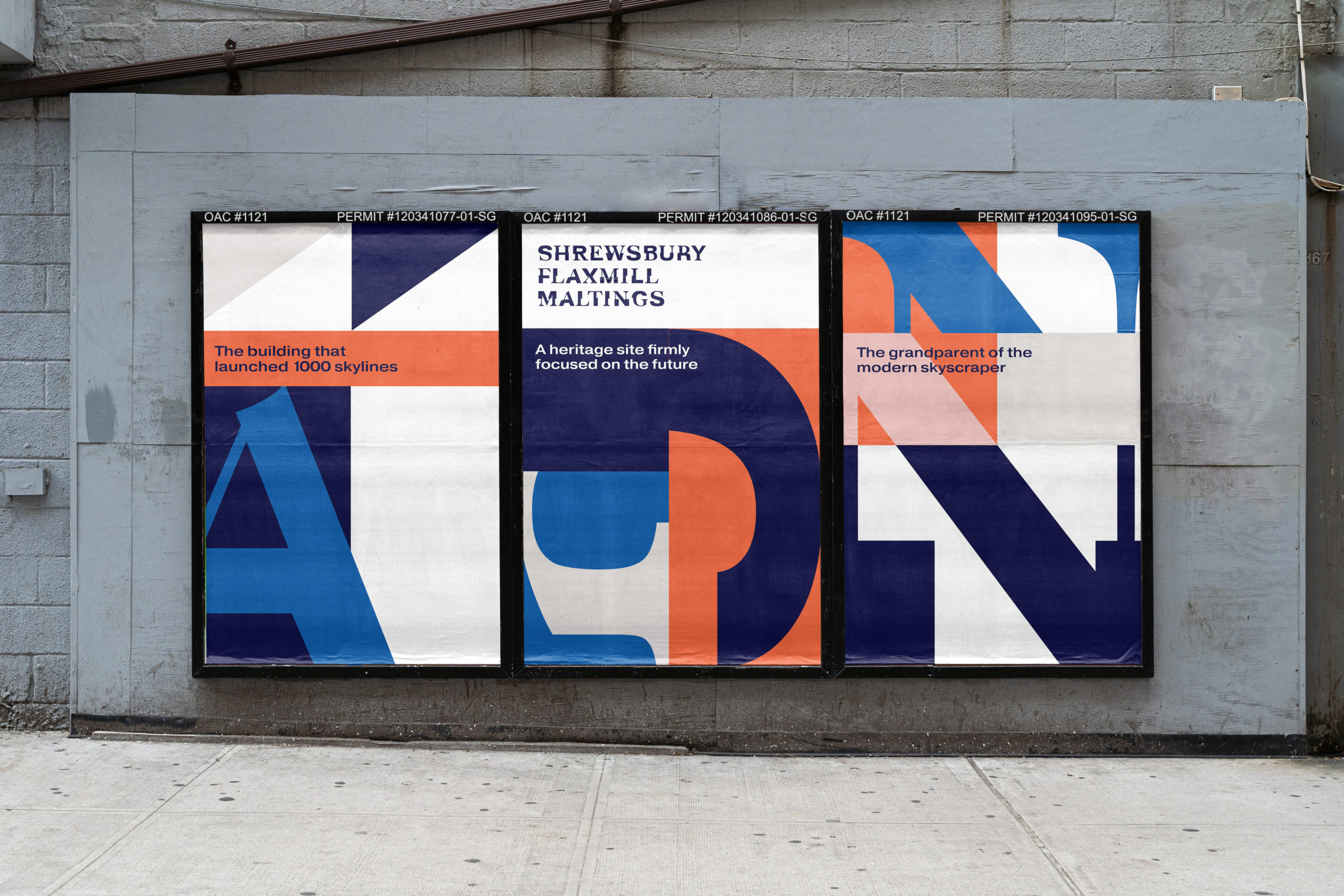
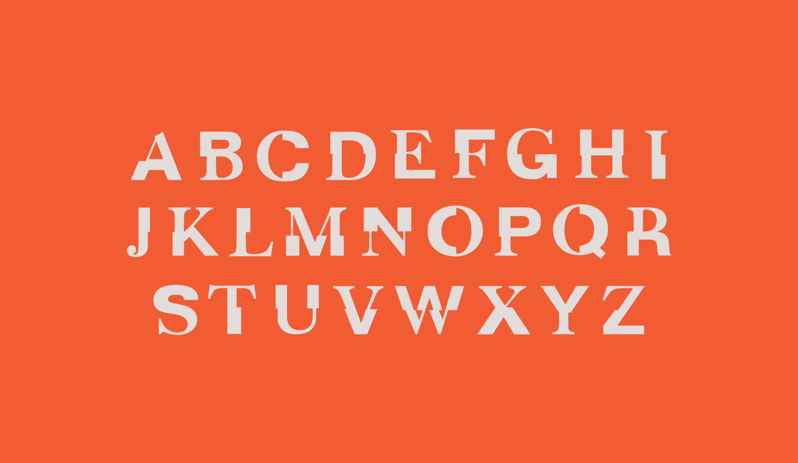
We produced a focussed direction for the Shrewsbury Flaxmill Maltings complex as a cultural destination and creative workspace which over time will evolve into a full place brand as the site is developed to include housing. Once this direction was fully developed with our client team, we set about translating it into a visual direction which focuses on a custom typeface – Edifice.
The custom font was the result of an experiment to combine two historic typefaces that feature on the building facades; a sans serif which features on the Cross Mill (‘Albrew Malters’), and a contrasting serif which can be seen on the front of the Main Mill (‘Shrewsbury Flaxmill Maltings’). In this way, the type reflects the contrasts within the site’s itself – history vs future; innovation vs preservation; mill vs maltings.
This typeface has been developed for use in the logomark and as a graphic device; it’s a font that you can play with to reveal new layers; new angles and imaginative compositions of mechanical detail. The mechanical animated logo mark encapsulates every aspect of the brand: experimental and innovative, original, adaptive, bold and experimental, inventive and creative. And just like the original building, its architects and the modern team – it’s unafraid to embrace the unconventional to make its mark on the world.
