Berwick-upon-Tweed is a hugely underrated British border town. It has a tourism and heritage offering that far surpasses many of its peers and yet the tourism economy is small and limited to only a few months of the year. In 2019 we completed work on a placebrand designed to bring out the best that Berwick-upon-Tweed has to offer to communicate its true status as a fantastic place to visit, to live and to invest.
Engagement and co-design were vital to this project in a relatively small town where nothing on this scale had been attempted before. We kicked off the public engagement process with a digital survey that was completed by 1500 people (almost 15% of the total population!) and then embedded ourselves in the town, conducting interactive workshops and working to build strong relationships with the local creative community, who we often find to be crucial drivers of change in place brand projects. The current tourism provision and marketing is heavily weighted towards the town’s heritage assets but the new place brand is designed to demonstrate how history, culture and natural beauty can synergise to form an unbeatable visitor offering.
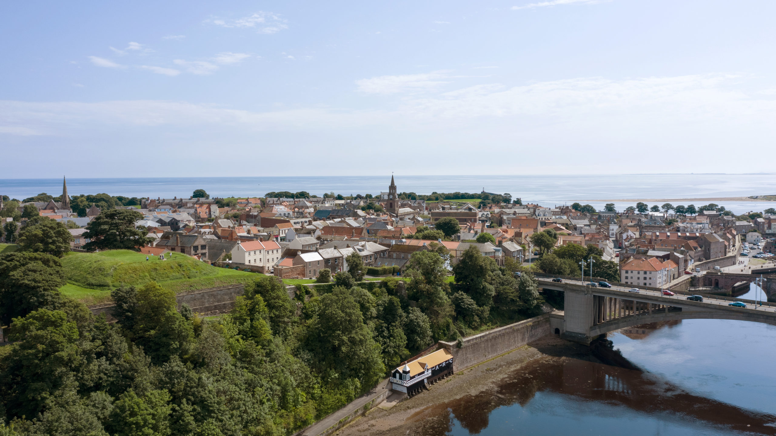
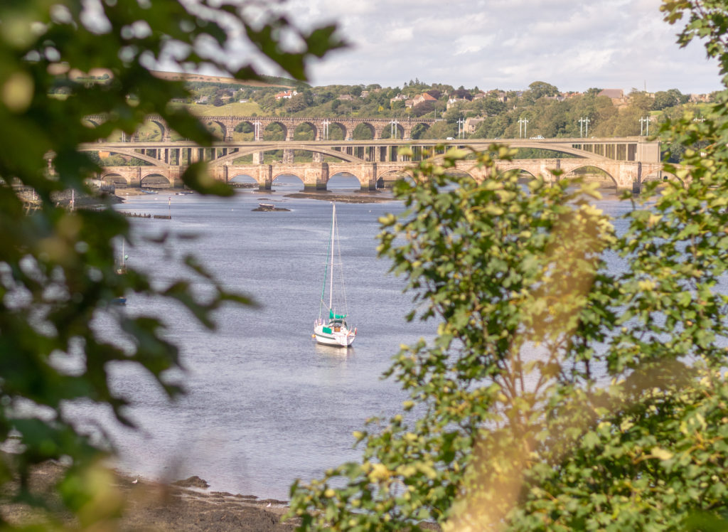
What we uncovered is a place that punches well above its weight in terms of arts offering, heritage stories and incredible scenery. We developed a brand narrative based around the pillars of discovery, independence, natural beauty and imagination and then worked to translate this into a visual identity.
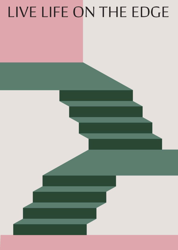
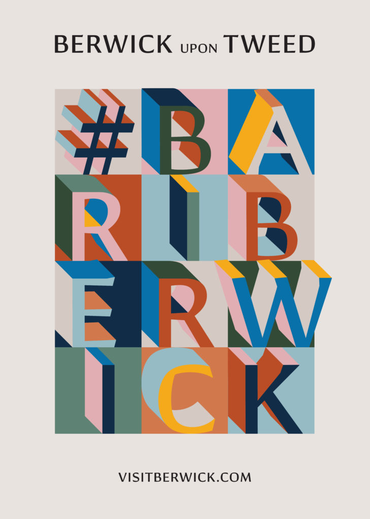
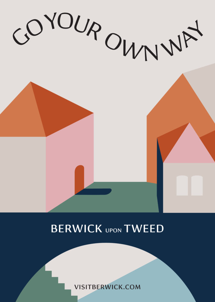
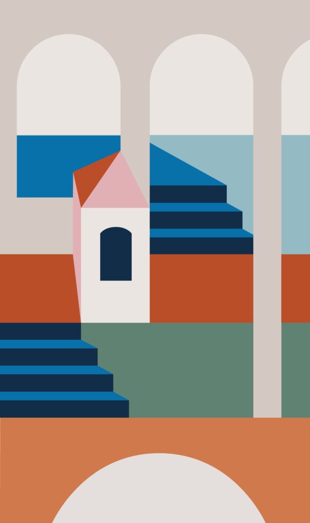
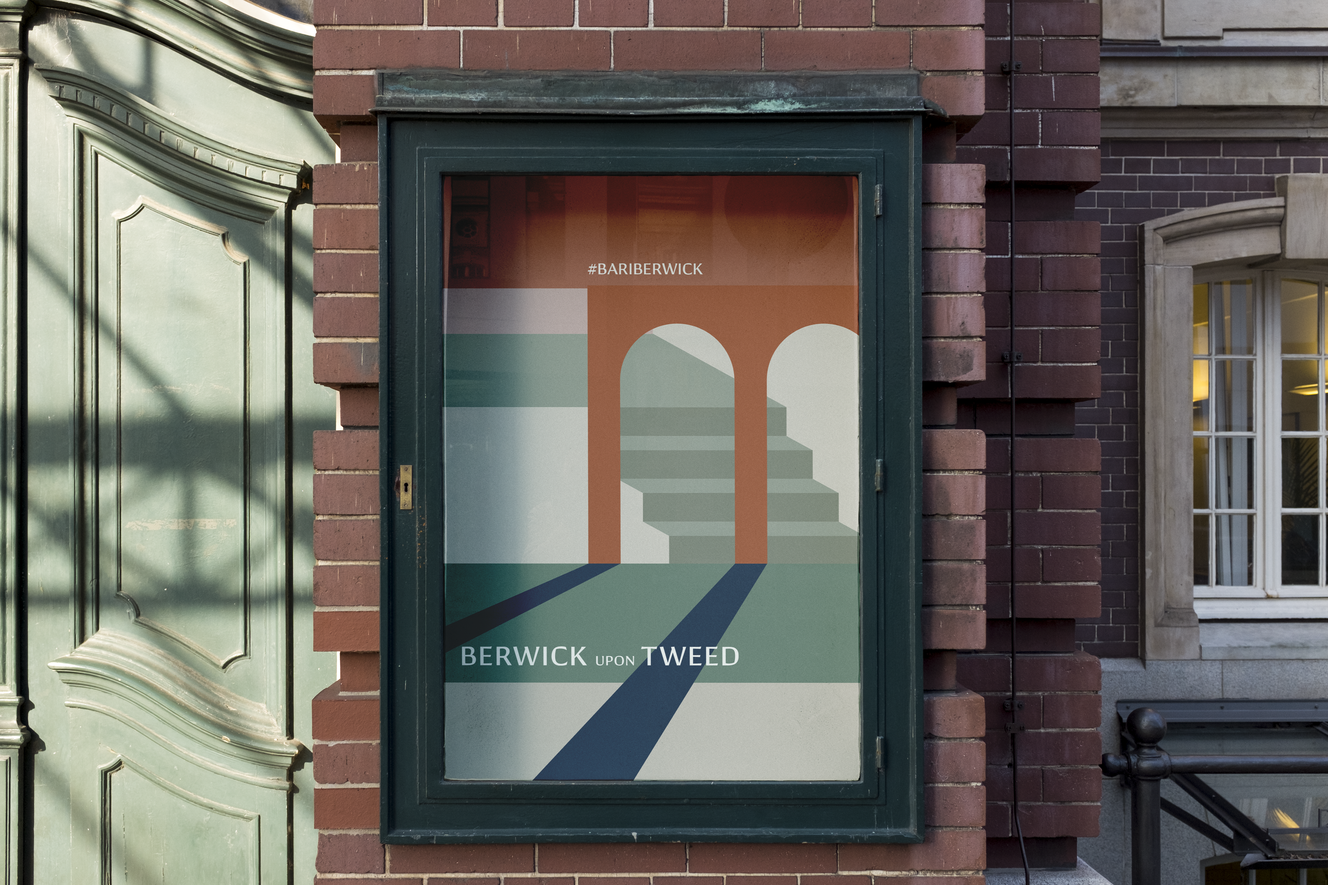
The resulting visual brand uses abstract illustration to evoke the stunning scenery as well as the beautiful built environment of the town. A contrasting palette of both modern (bright sunshine yellow, pale sky blue) and heritage (terracotta, warm brown and dark blue) colours works alongside the illustrations to create a layered effect – representing the layering of geography, history and culture that create the unique space Berwick-upon-Tweed occupies outside of traditional labels.


Approach
The primary typeface – Conglomerate – is the perfect fit for Berwick, because it lies somewhere between sans and serif, square and rounded, calligraphic and geometric, giving it a subtle yet unorthodox blend of typographic traits. This results in a clean, unique and versatile font family that does well not to lean too heavily on any particular historic model.
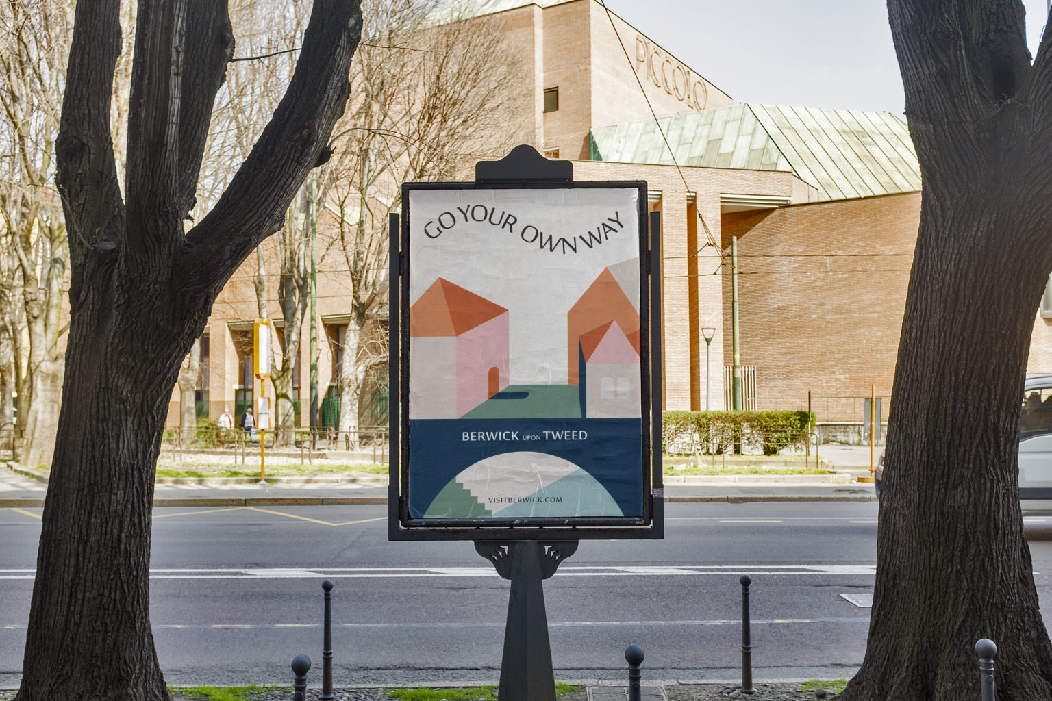
The type bends and flows in some applications, which captures the depth and perspective of Berwick’s scenic roofscape, bridges and tunnels and the digital applications also use curving lines of text, directly referencing the meandering river and coastline that the town is known for.
Now that we’re across the finish line with the delivery of the toolkit I thought I’d take some time to thank HemingwayDesign for your commitment to and involvement in the Place Branding project in Berwick. It’s been really good fun working with you, and there are aspects of the project like the levels of engagement you achieved that were truly inspiring. Thank you for everything.’
– Gareth Davies, Town Clerk.
