With 40 years in the industry, two generations, 100s of projects completed, millions of people involved, engaged and entertained, we felt it was time for a brand refresh that reflects who we are now.
The thing is that we’re brand consultants ourselves. We develop brand narratives, we work on values and purpose, we collaborate on brand overhauls, we create visual identities, and we’ve done it for years for dozens of different clients – from whole cities, festivals and cultural institutions down to club nights, one-off events and community groups. But how the hell do we do it for ourselves?
Because we’re a family business and a smallish team, we don’t have defined values – we just have an innate sense of who we are, and a simple philosophy that design is about improving the things that matter in life. Which is all well and good until you need something on which to base a new visual identity. So we had to have a big think about who we are and what we do – and how we can articulate what we do because it’s so broad.
We discussed it for months, surveyed ourselves, sent a lot of emails and even held a workshop on a train to Margate and came to quite a simple conclusion – we’re pretty proud of what we’ve achieved. We can’t stop ourselves from getting involved where we see potential to contribute to positive change. We love places and people and are absolutely convinced that design can make a real difference. We have expertise, intelligence and strong views on what’s important (healthy, happy fulfilling lives for everyone; inclusion, equality, sustainability) and we believe – in fact we know from experience – that achieving all these things can be fun too.
We are not restricted by a house style, or by process (although we have tried and tested methodologies). We have a subjective point of view that is considerate of diverse and divergent perspectives. We’re plugged into the Zeitgeist; we understand cultural context and social issues that affect and shape people’s lives every day.
Our greatest strength lies in the multidimensional way we look at all projects, which comes from years of multi-disciplinary design experience and a highly motivated team that share their expertise and learnings across all the projects that we work on.
So how does this translate into a visual identity? It needed to be simple and straightforward – no fuss, no pretention. It needed to be visually appealing of course, because the world always needs more beauty. It needed to be modern and forward-thinking whilst being accessible and never intimidating. It needed to be a brand that when applied never overshines the content; that communicates subtly, making sure it’s our work that’s always the focus, not ourselves.
So this is what we have – a black and white logo mark for simplicity.
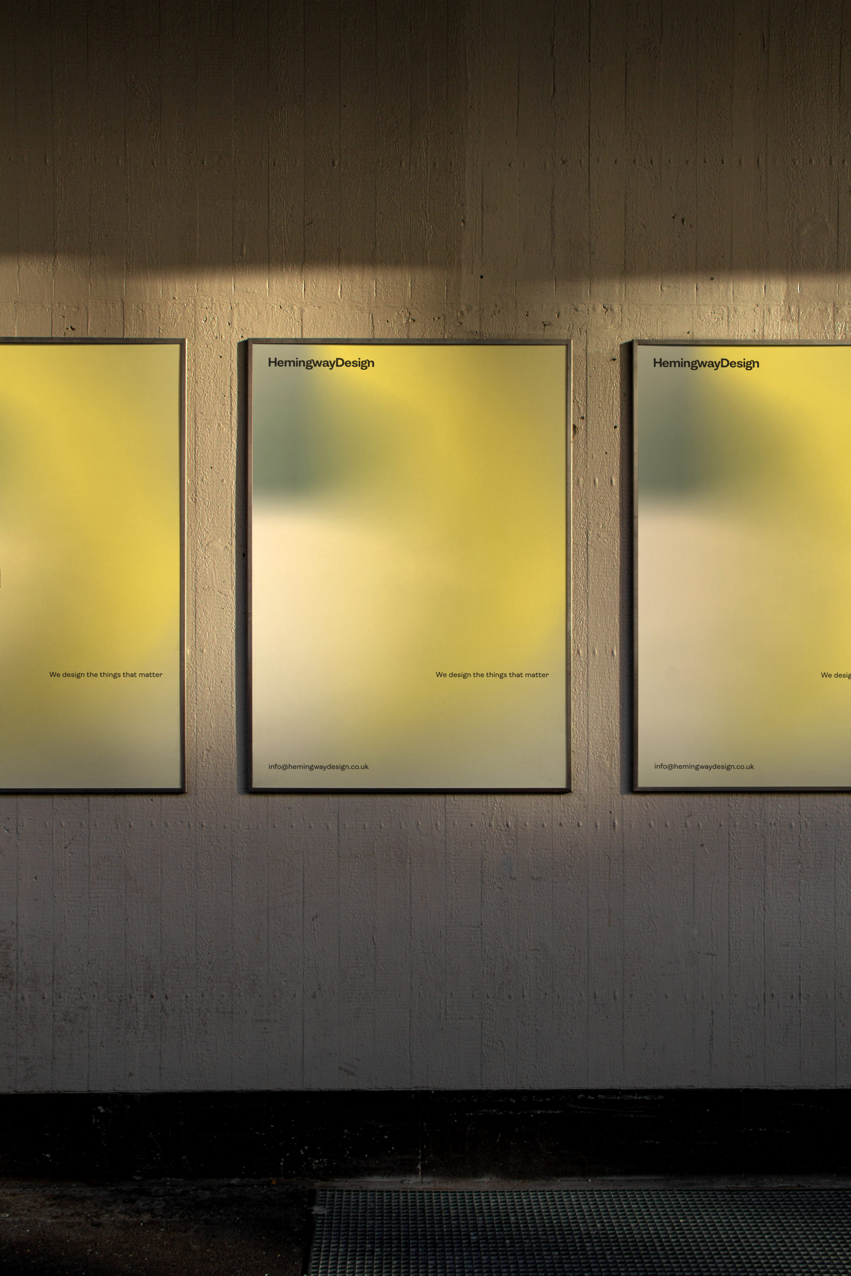
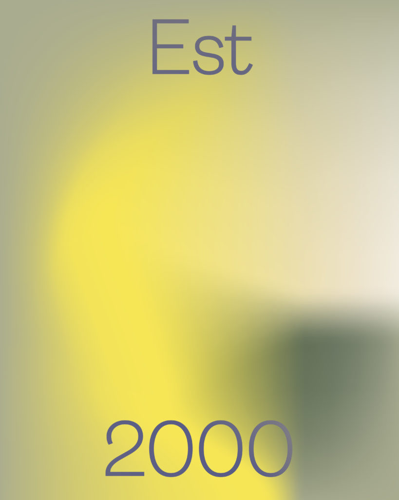
An identity to capture the fluid nature of our multi-disciplinary practice and our unconstrained spirit. A gradient mesh blend as the the primary visual language, to referencing connectivity, collaboration, movement, discovery and the unexpected and a broad, adaptable colour palette to play around with and have fun.
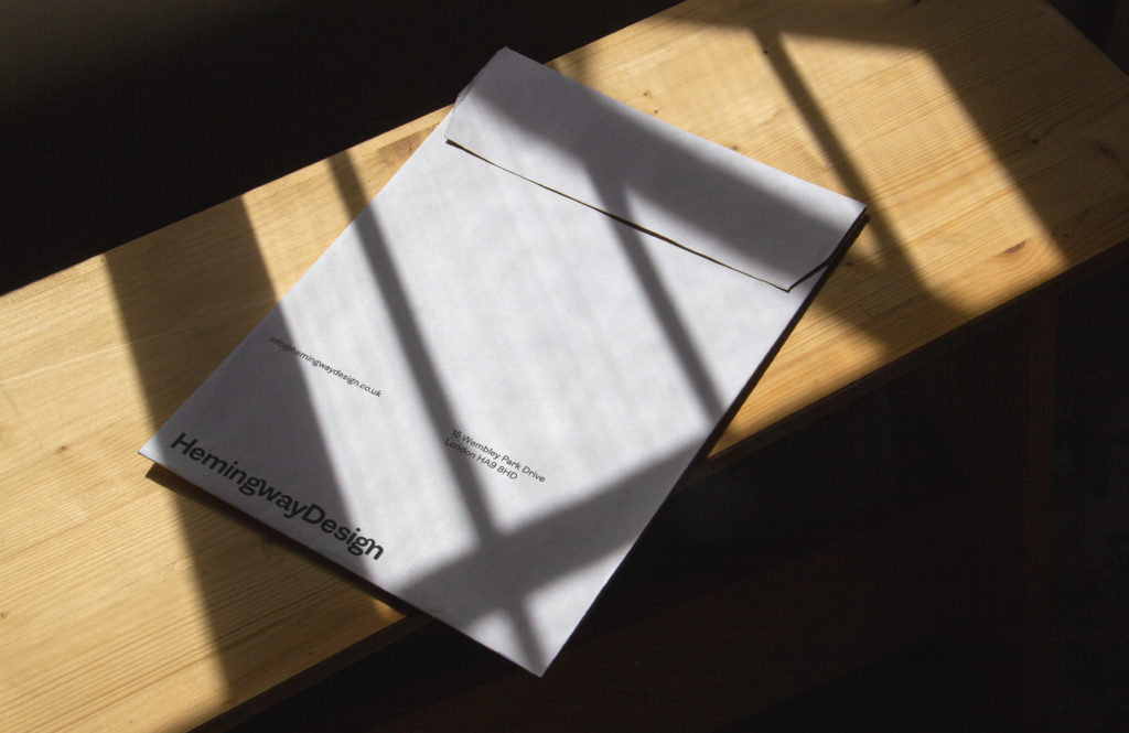
Our new primary typeface Ambit takes inspiration from early grotesques (we do love vintage culture) but has been updated for the 21st century. As a sans serif it’s friendly and simple, but has distinctive details to set it apart.
We really like it and we hope that you do, too.
