In 2015, we were just about to launch our Transport for London staff uniform.
At HemingwayDesign when we started designing the new London Transport uniform to a brief of “make the team more recognisable on platform, on concourses, in ticket offices, and for the uniform and wearer to take pride in an internationally recognisable brand but one that has almost disappeared from the current uniform.”
Through our design work with Transport for London I was asked to choose my favorite piece of design from London Transport as part of their new initiative Transported by Design and talk about it at the launch last week at the Transport Museum in Covent Garden.
“Transported by Design is a celebration of London Transport’s rich design heritage, which dates back over 150 years. Running from July 2015 to early 2017, this programme of events, exhibitions and competitions will raise awareness of the pioneering design used every day by Londoners and visitors to the city, showing the impact of good design.”
Whilst the LT design history is wonderfully extensive, my choice came straight to mind. The Roundel. The Roundel really does achieve the Holy Grail for designers and branding experts in that it is instantly recognisable (in fact it’s in the top ten most recognisable logos in the world up there with the Nike tick and Coca Cola) and timeless.
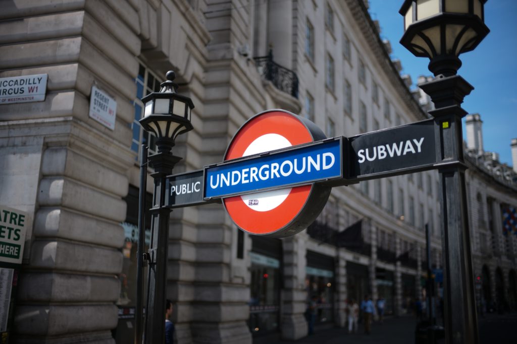
Products with the roundel on it are the best sellers in the LT Museum shop and in gift shops across London. As the London Transport Museum’s website shows, the roundel first appeared in 1908 and evolved over a few years to become the logo that we know today. For many it’s the sign that people look for to find an underground station, a bus stop, an overland station, or a bicycle hire point.
It’s the envy of the world’s transports systems. The Paris Metro may have some ornate signage but not the simplicity and recognition and this is what Mark Heavey, director of marketing and advertising for the Metropolitan Transportation Authority which operates New York’s subway, said:
“The roundel – the disk and the bar graphic, really in all of its forms, I find to be instantly recognisable as the embodiment of London Underground brand.
“It exudes so much history, British tradition, and really screams London as much as Big Ben, red phone boxes or double-decker buses. In New York City we don’t have the same unifying element that people look for. We have some subway entrances that have a globe, there’s others that do not and it is certainly not as consistent as it has been in London for over a century.
“That’s really the hallmark of branding, it’s consistency.”
At HemingwayDesign when we started designing the new London Transport uniform to a brief of “make the team more recognisable on platform, on concourses, in ticket offices”.
An obvious response could have been to design a “loud” uniform, however the first thing we noticed was that the roundel was almost invisible on their current uniform, often being embroidered in solid silver or blue. Herein lay the design solution. It was obvious.We needed to “dial up” the roundel, make it bold, and show it in its worldwide recognisable form.
Just like my choice of design icon from London Transport’s history, it was obvious. And just like the roundel itself, it works.